
This info graphic of cartoon characters shows very good use of contrast. The colors flow very well from one color to the next, as the different characters are placed around the color wheel. It also is a good use of contrast, because like all color wheels should be, each color is across from it's contrasting color.
Bad use of Contrast:
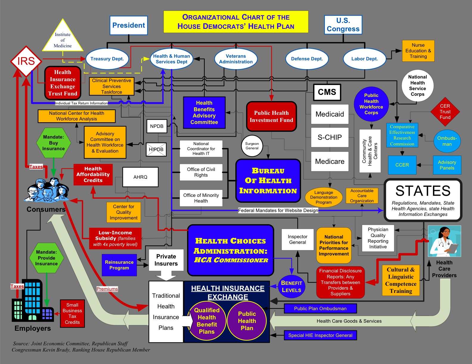
This info graphic is a good example for a bad use of contrast. It's obvious that there wasn't very much thought into which colors were being used for each item on the map. Also, everything is very scattered and just kind of all over the place.
No comments:
Post a Comment