Thursday, December 8, 2011

Visual Techniques


1st Image: Manhattan Subway Map - Infographic

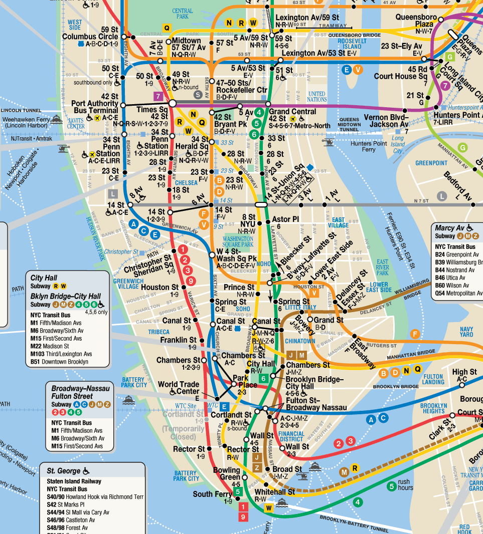
Visual Techniques: Balance, Contrast, Predictability, Consistency, Accuracy, Flatness, Sequentiality

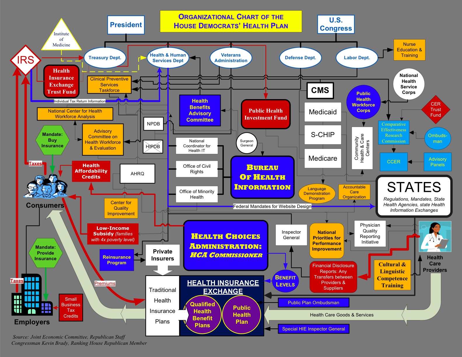
2nd Image: Symbolic map of the US - Infographic


Visual Techniques: Flatness, Accuracy, Consistency, Activeness, Unity, Balance, Contrast, Sequentiality

After comparing these two info graphics, it was interesting to see how they use some of the same techniques, but also use some different ones. What also made it cool is that they are both maps, but used in very different ways and in opposite scales. They both show consistency, balance, contrast, accuracy, flatness, and sequentiality. These are all things maps should require, except for maybe flatness. Since both are getting across information about a specific place, it is important that they are both accurate. They also both show consistency, balance, and contrast, by their use of colors and placement of text and imagery. Unlike the 1st image, the 2nd image shows activeness with the waves draw into the water, as well as some of the animal symbols on the map.

Thursday, December 1, 2011

Contrast


Good use of Contrast:

This info graphic of cartoon characters shows very good use of contrast. The colors flow very well from one color to the next, as the different characters are placed around the color wheel. It also is a good use of contrast, because like all color wheels should be, each color is across from it's contrasting color.

Bad use of Contrast:


This info graphic is a good example for a bad use of contrast. It's obvious that there wasn't very much thought into which colors were being used for each item on the map. Also, everything is very scattered and just kind of all over the place.

Thursday, November 17, 2011

Movement/Motion

OPTION 2:

The first image I found was a tutorial for an iPad game. This tutorial shows the user how to navigate around the game, and how to use the camera to see the different views. This tutorial leads the user through the interface in multiple ways. First, on the left it shows the three images of pan camera, rotate camera, and zoom in and zoom out. They are placed kind of in a zig-zag form, leading your eye from the top one to the bottom one. Next, the numbered list on the right leads our eye down that list, from 1-3. These are the instructions that further explain the images on the left. We then link these instructions with the images on the left, lining up each number with each image.


The second image I found is an interface design for an avatar creator for "sanrio land". The first thing the user will navigate through, is the experience of creating their avatar. Our eyes our lead down the list of icons, depending on which part of our avatar we want to change. It goes from hair, eyes, clothing, etc, leading down the list until we have our avatar completed. We next see the bottom part, which show us different stats, such as birthday, gender, etc. After that, our eyes are then lead to the "about me" section. Here we see icons representing things like our favorite food, favorite song/music, favorite movie, favorite sanrio character, etc. The "tips" at the bottom help lead you through creating your character in this interface. After that, we are pretty much completed creating our avatar. The rest of the menu we see on the right then is linked to the screen after we are done creating our avatar. These menu options link to navigating around the sanrio land, and other menus throughout the game.

Thursday, November 10, 2011

Dimension/Depth/Space/Scale


The image I chose to use for my blog exercise this week, is the interface for a GPS navigational system, more than likely being used in a car. This image shows great examples of depth in several different ways. First it shows a good use of overlap with the buildings, especially on the left side of the image. They are overlapping each other, showing that they are farther and farther away in distance. These buildings are also a good example of relative size and relative height. They get smaller and shorter as you move farther away in the picture. Also, watching how the road moves down and there is a vanishing point and horizon, shows that the roads are stretching out farther and farther away. Also, the arrows on the street show some flow pattern, showing movement along the road.

Thursday, November 3, 2011

Tone and Color


TONE
The image I found that I decided to use for tone is an info graphic of the US, showing the obesity levels throughout each state. They use different tones of red and green to represent the different percentages of obese people. Tone in this map works by showing that the most saturated and brightest version of the red represents the largest percentage of obesity. The most saturated and brightest version of the green represents the least percentage of obesity. Then depending on the amount, the tone fades from the red to the green, going from most obese to least obese. This map that uses tone also uses lines. They work together by the white lines separating the different states, being able to separate the tones from each other.

This example is also a good use of color. It's very symbolic for red to mean "bad" and green to mean "good". This graphic uses those colors in that exact way. In this graphic, I would say color works with direction, at least in the top bar or "key" showing the different obesity levels. You could also even say it is a line too, because it uses the change of color, over a line, to direct your eye from left to right.

Thursday, October 27, 2011

The Basic Elements - Mario Game Box Covers


1) Super Mario - Dimension

Even though it's very simple and not the entire design, this cover shows a very good example of dimension in the blocks that Mario is breaking through. These blocks pop out/appear to be more 3D than the rest of the cover, simply because of the way they are placed upon another block, offset, and set to different transparencies. The way it's designed, it's set up for the white/light blue part of the block to be the front, while the dark blue/light blue part is the back of the block. This gives the blocks the illusion of dimension.


2) Super Mario 3 - Direction


This cover design for the Super Mario 3 game shows a good example of the use of direction in two ways. Both use a diagonal line, directing the eye from the bottom left of the design, to the top right. The most obvious one would be the way Mario is positioned, and how he has his arms open as if he was flying. Your eye is lead from his feet, up to the tips of his fingers. Also, the title "Super Mario 3" is at a diagonal slant, leading your eye once again from left to right.

3) Super Mario Allstars (Wii) - Shape


Last, this more recent cover for Super Mario All Stars (Wii), shows a good example of the use of shape. I was able to find about twelve different circles throughout this design, including the "o" in Super Mario. First in the top left corner, showing that it's Mario's 25th anniversary. Next there is the large circle with a golden Mario in it, which has about nine circles within that circle. The 6 little circles with the stars, the circle around gold mario, the two "o"s in the design, and the blue circle that's holding the rest of the circles. This design is a good example of shape, because it uses the shape of a circle to support the entire design.

Thursday, October 13, 2011

Feature Hierarchy

The image I chose to use that shows examples of "channels", is this map of San Francisco that I found using google images. I'm very interested in information design, as well as maps always really catch my attention, so I figured this would be perfect to use for this assignment.
This image uses good examples in many ways. Although there is very little use of color, since it's just a black on white image, the black outline of the city and the different areas of the city, as well as the text really stand out. The shape of the map is definitely split up into channels, by how each section of the city is outlined, with the name of each district within it's area. Also, underneath the outline of the city, the words "San Francisco" line up perfectly with the size of the city's outline. This map definitely shows motion by using different size font throughout the map. The larger more thicker letters stand out more, leading your eyes directly to them. This gives the larger areas in San Francisco an "unfair advantage" because they get to be noticed first. Lastly, the spacial layout fits along perfectly with the districts in San Francisco. Each district is it's own space, requiring the spacial layout to be exact.