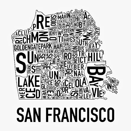
This image uses good examples in many ways. Although there is very little use of color, since it's just a black on white image, the black outline of the city and the different areas of the city, as well as the text really stand out. The shape of the map is definitely split up into channels, by how each section of the city is outlined, with the name of each district within it's area. Also, underneath the outline of the city, the words "San Francisco" line up perfectly with the size of the city's outline. This map definitely shows motion by using different size font throughout the map. The larger more thicker letters stand out more, leading your eyes directly to them. This gives the larger areas in San Francisco an "unfair advantage" because they get to be noticed first. Lastly, the spacial layout fits along perfectly with the districts in San Francisco. Each district is it's own space, requiring the spacial layout to be exact.
No comments:
Post a Comment